OVERVIEW
This page features a unique collection of logos I have worked in past years.
I am a professional logo designer with a passion for creating unique and eye-catching logos that represent the essence of a brand. I believe that a logo is the face of a company, and it should be memorable, simple, and meaningful.
I utilize industry standard tools and best practices to solve a range of design problems. My multi-step design approach consists of research, brainstorming, sketching, prototyping, and feedback gathering.
INFO
My role
Design and Art Direction
platform
Illustrator, Photoshop
CASA KUARA
The logo for this bed and breakfast property in the a picturesque beach village northeast of Brazil, Praia de Guajiru, in Ceara. It captures the essence of the region’s sunny and tropical climate with a design features a stylized sun with warm and inviting yellows colours, which represent the warmth and hospitality that guests can expect from their stay. The sun’s rays gives the logo a unique and memorable touch.
FEMI
As part of a big rebranidng studies, I helped Fabi Almeida to update the brand logo to reflect a new strategy for her clothing label. The main goal is to represent the search for the self esteem and identity from the ancestrality foundations, guided on the african aesthetics. The Baobab tree is a symbol of strength, resilience, and longevity in African culture, and it is featured prominently in the brand’s logo
SENHORES BOLOS
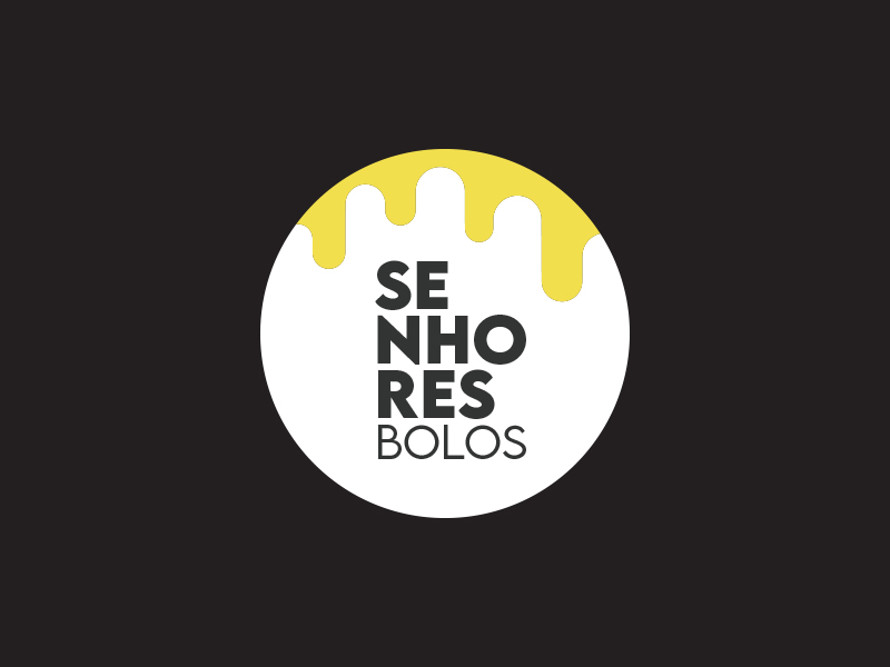
The logo design for this cake label is a mouth-watering treat for the eyes! It features an elegant and playful design that perfectly captures the essence of a delicious and indulgent cake. The logo incorporates a colorful and artistic drip, along with the brand name. The typography used in the logo is modern and classic, with a fun and playful twist. The logo’s design is both eye-catching and memorable, making it the perfect representation of the delectable and irresistible cakes that the brand has to offer.
Fernanda Ribeiro
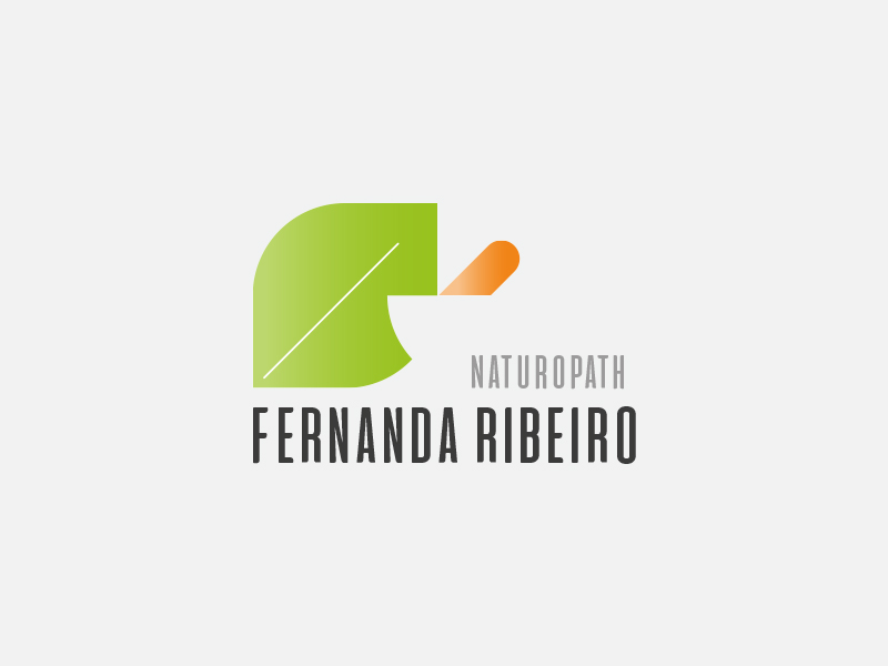
This piece was created for Fernanda Ribeiro, a naturopathy specially based in Australia. The logo design for this naturopath professional perfectly blends traditional healing practices with modern medicine. The design features a mortar, which is a symbol of ancient herbal medicine, and is often associated with the practice of naturopathy. The mortar is depicted in a modern and minimalist style, with clean lines and a subtle color palette, giving it a contemporary twist. The logo’s design is a reflection of the naturopath’s commitment to holistic healing and is sure to resonate with individuals seeking a natural approach to wellness.
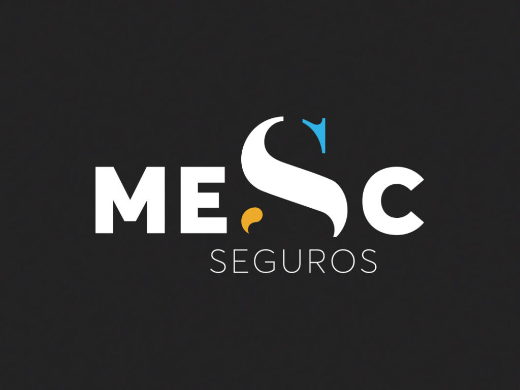
MESC
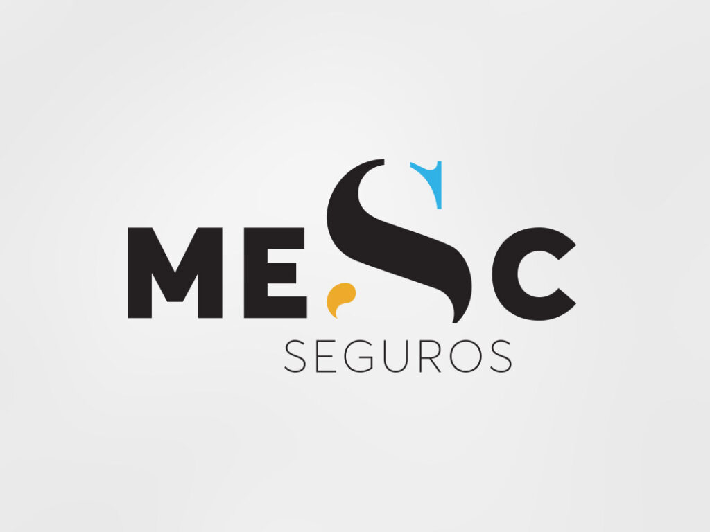
The typography logo design for this insurance company exudes a sense of professionalism, reliability, and trustworthiness. The design features the brand name written in a bold serif font, with a subtle twist that adds personality and memorability. The letters are perfectly spaced and aligned, creating a balanced and harmonious composition. The color palette used in the design is typically muted and conservative, with shades of blue, orange, and black, which are commonly associated with insurance and financial services. This typography logo design conveys a sense of stability, security, and dependability, making it the perfect representation of the insurance company’s values and mission.
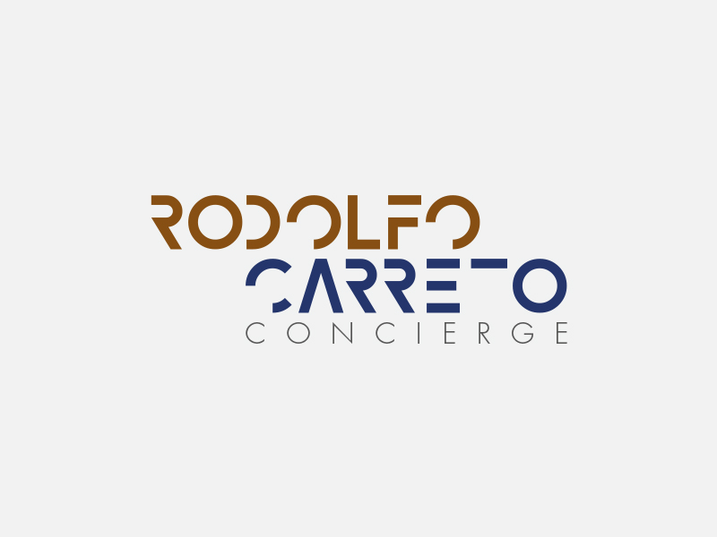
Rodolfo Carreto
The typography logo design for Rodolfo Carreto, a personal travel agent and concierge, is elegant and sophisticated, perfectly reflecting the luxury and personalized service that he provides. The design features the full name in a deconstructed font, with the first name written in a slightly different aligment than the last name, creating a visual hierarchy that emphasizes the personal touch of the service. The color palette used in the design is typically muted brown, blue, and black, which evoke a sense of luxury and exclusivity. This typography logo design is sure to resonate with individuals seeking a high-end and personalized travel experience.
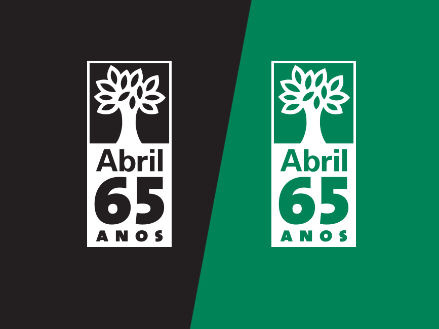
Abril
The winning logo for the 65th anniversary logo contest of Abril Comunicações publishing company is a perfect representation of the company’s values, heritage, and tradition.

ELTON THADEU
The typography logo design for Elton Thadeu, a talented makeup artist, is chic and stylish, perfectly reflecting his expertise in the beauty industry. The design features the full name in a modern and elegant sans-serif font, perfectly spaced and aligned, creating a balanced and harmonious composition. This typography logo design conveys a sense of creativity, professionalism, and artistic flair, making it the perfect representation of Elton Thadeu’s unique style and approach to makeup artistry.


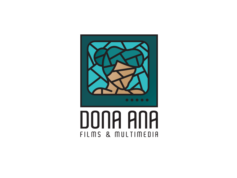
Dona Ana
The logo design for this film and multimedia company is a perfect blend of modern technology and classic artistry. The design features a stylized woman on a TV, with a minimalist and abstract approach that creates a unique and memorable identity. The woman’s silhouette is sleek and elegant, with clean lines and a simple color palette that creates a sense of sophistication and modernity.

Naia Prado
The logo design for Naia Prado, a yoga instructor and body therapist based in Barcelona, Spain, features a stylized triangle, a symbol commonly associated with strength, balance, and spirituality. he triangle is intricately detailed, with organic lines and shapes that create a sense of movement and fluidity. The typography used in the logo is modern and minimalist, with a clean sans-serif font that complements the geometric design elements. This logo design conveys a sense of strength, balance, and inner peace, making it the perfect representation of Naia Prado’s mission to help her clients achieve physical and emotional wellness through yoga and body therapy.
